

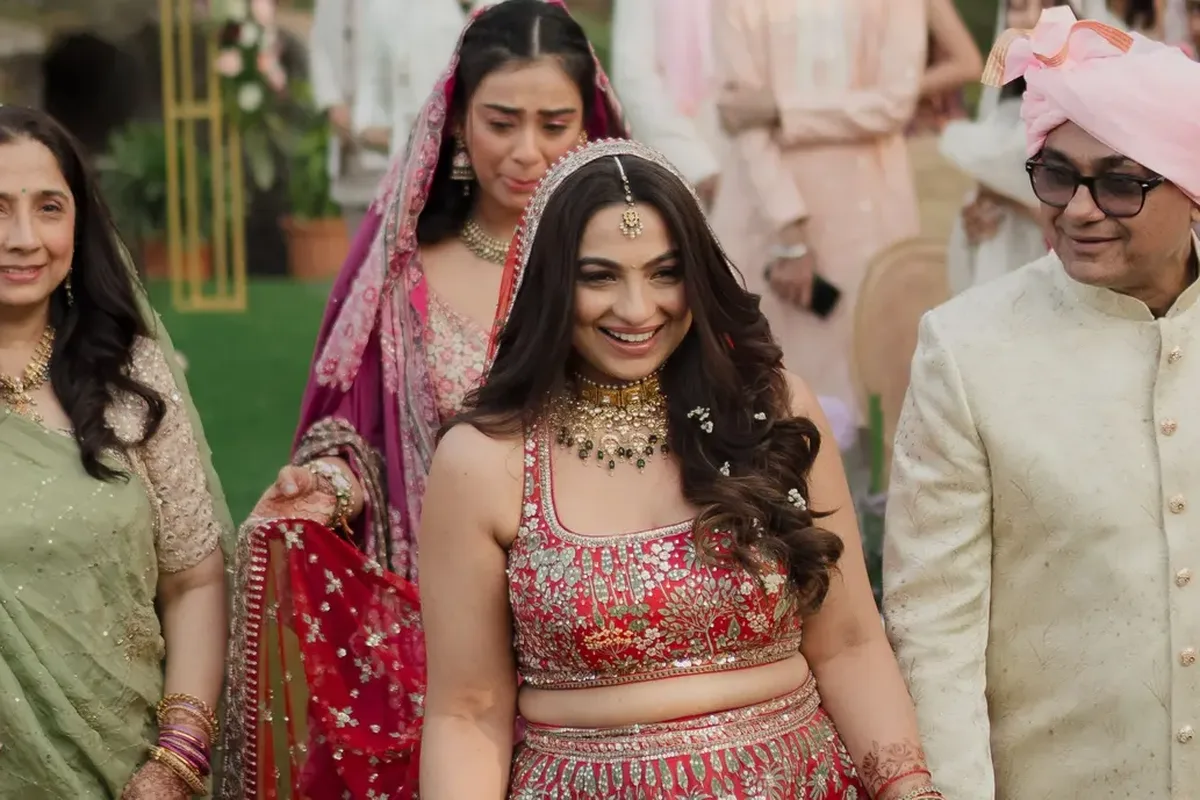
Indian weddings are among the hardest things to grade in all of filmmaking. Saturated reds sit beside pale ivory, gold jewellery catches the sun, and the same face passes through a dozen kinds of light in a single day. Colour grading is the quiet craft of making all of it look the way the day felt.
1. Start with skin, because everyone checks it first
Viewers may not notice a slightly muted sky, but they will notice when a bride looks sallow or a groom looks orange. We set skin tones first and hold them steady from shot to shot, for every skin tone in the family, and then build the rest of the colour around them.
2. Protect the loud colours: reds, marigold and gold
A bridal red can clip into a flat red patch, marigold garlands turn neon, and gold jewellery slides towards green. These are the colours people paid for and remember, so they get careful, separate attention. The goal is rich and believable, never loud for its own sake.
Make it look the way the day felt, not like a filter.
3. Mixed light: one hall, five colour temperatures
A single reception hall can have warm tungsten bulbs, cool tube lights, coloured stage LEDs and daylight from a doorway, all in one frame. Each pulls skin towards a different tint. We correct them shot by shot so a face looks like the same face in the haldi morning, at the mandap and under the sangeet lights.
4. Match the cameras before styling anything
Two cameras shoot the same moment and render it differently. Before any creative look is chosen, we balance the cameras to each other so a cut between them goes unnoticed. Style comes second. A look laid over mismatched footage only makes the mismatch louder.
5. Grade for the screens it will really play on
A wedding film is watched on phones, laptops, a living-room television and often a projector at the reception. We check the grade on several of them and avoid extremes: shadows that vanish on a phone in daylight, or highlights that glare on a big screen. A grade that survives all of them is a grade that lasts.
Choose a look that will age well
Trends in colour come and go quickly: heavy teal and orange, faded film, crushed blacks. A wedding film will be watched for decades, so we prefer a warm, natural look that suits the couple and the setting. It will still feel right when the children are grown and press play.
This is the work we do for photographers and filmmakers who want their footage finished with the same care they gave it in the field, colour and grade included. If your footage is waiting for its true colours, we would be glad to help. You can see the kind of work we mean in our portfolio.